BrainStation UX Design Capstone Project
SousChef
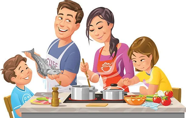
During my BrainStation UX Design bootcamp, I focused on solving a problem that’s personal to me. As a self-proclaimed five-star home chef from a family that deeply values cooking, I set out to design an app that helps people learn to cook with confidence. I wanted to reduce the stress, confusion, and anxiety often associated with the kitchen, and create a user-friendly experience that makes cooking more approachable, enjoyable, and empowering.
Roles: Researcher, UX & UI Designer, Writer
Tools: Figma, Google Suite, Superimpose
Method: Double Diamond
Timeline: 10 Weeks
Platform: iOS
Design Challenge Outline
Problem: Decline in Home Cooking Among Young Adults
67% of Gen-Z adults lack the ability or motivation to cook for themselves.
Home cooking can save up to 90% per meal compared to eating out.
Cooking at home helps track daily nutrition intake for a healthier lifestyle.
Objective: Develop a Digital Solution
Research how to encourage and support young adults (18-25) in cooking.
Focus on those living independently who may struggle with meal preparation.
How Might We Question:
How might we encourage and help young adults cook meals for themselves so that they can save money and lead a healthier lifestyle?
Key Research Insights
Secondary Research
64% of Gen-Z adults prefer eating out because they cannot cook.
50% experience stress or anxiety about cooking.
Many blame their lack of experience from a young age.
Common reasons for not cooking:
Convenience: Food delivery apps & ready-made microwave meals.
Time constraints: Gen-Z reports having less time than millennials.
Diet habits: Gen-Z is 30% more likely to eat frozen/microwavable meals than millennials.
Dining out experience discourages cooking skills.
Tech habits & cooking:
66% use their phone while cooking.
71% watch cooking videos for help (56% use TikTok or similar apps).
Primary Research
Interviewed 3 individuals who met the criteria for my problem space (18-25 years old and living on their own)
Derived common goals, motivations, behaviors, and pain points.
Key Research Findings
66% of Gen-Z young adults say they cannot cook.
Many experience stress & anxiety when cooking.
70% use their phones as a cooking aid.
Cooking is seen as too time-consuming.
Ordering takeout is the preferred choice due to convenience.
Opportunity Selection
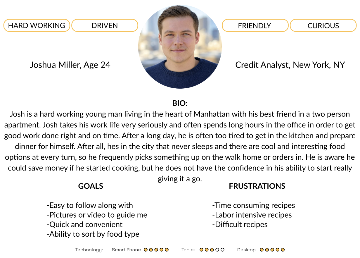
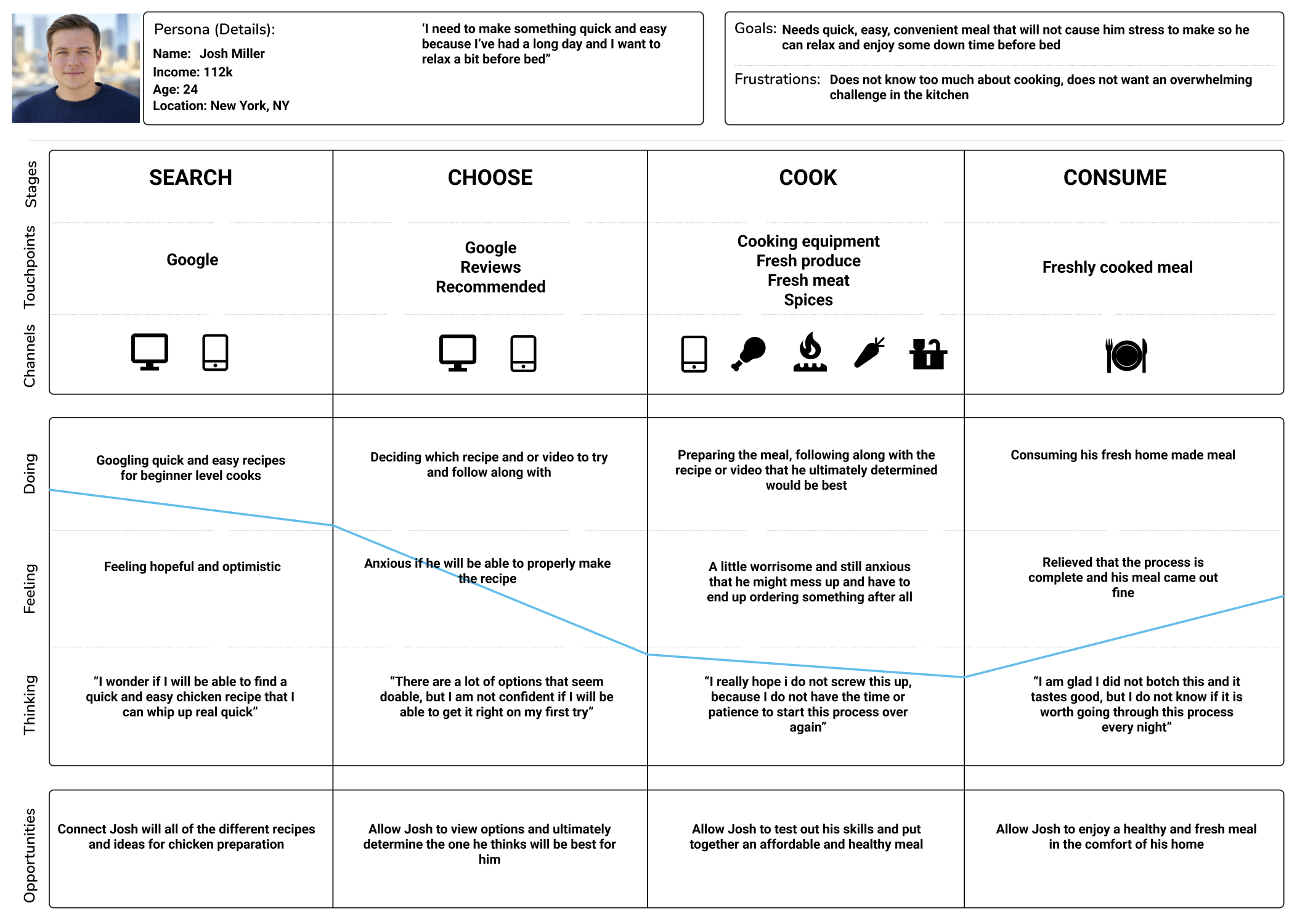
After compiling my research findings, I developed a persona and experience map to help best understand the core needs and wants of my intended users. During this process I made a handful of key discoveries that would later play a large role in shaping my solution:
Provide the option to filter by difficulty, cuisine, and ingredients
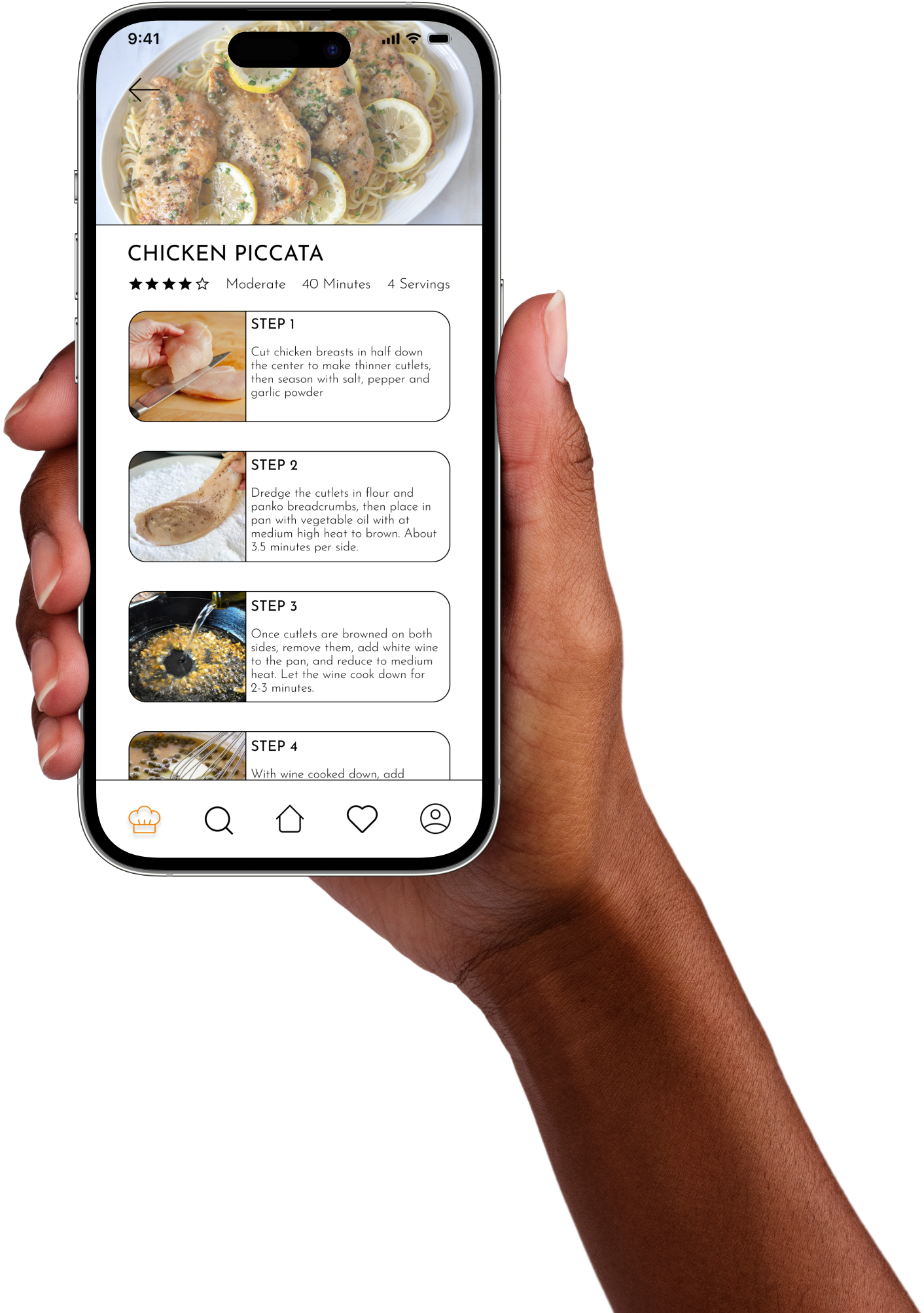
Provide super easy step by step instruction accompanied with images
Offer the ability to save recipes to come back to in the future
Display other user ratings and reviews for recipes
Display trending recipes that similar users are enjoying on the home page
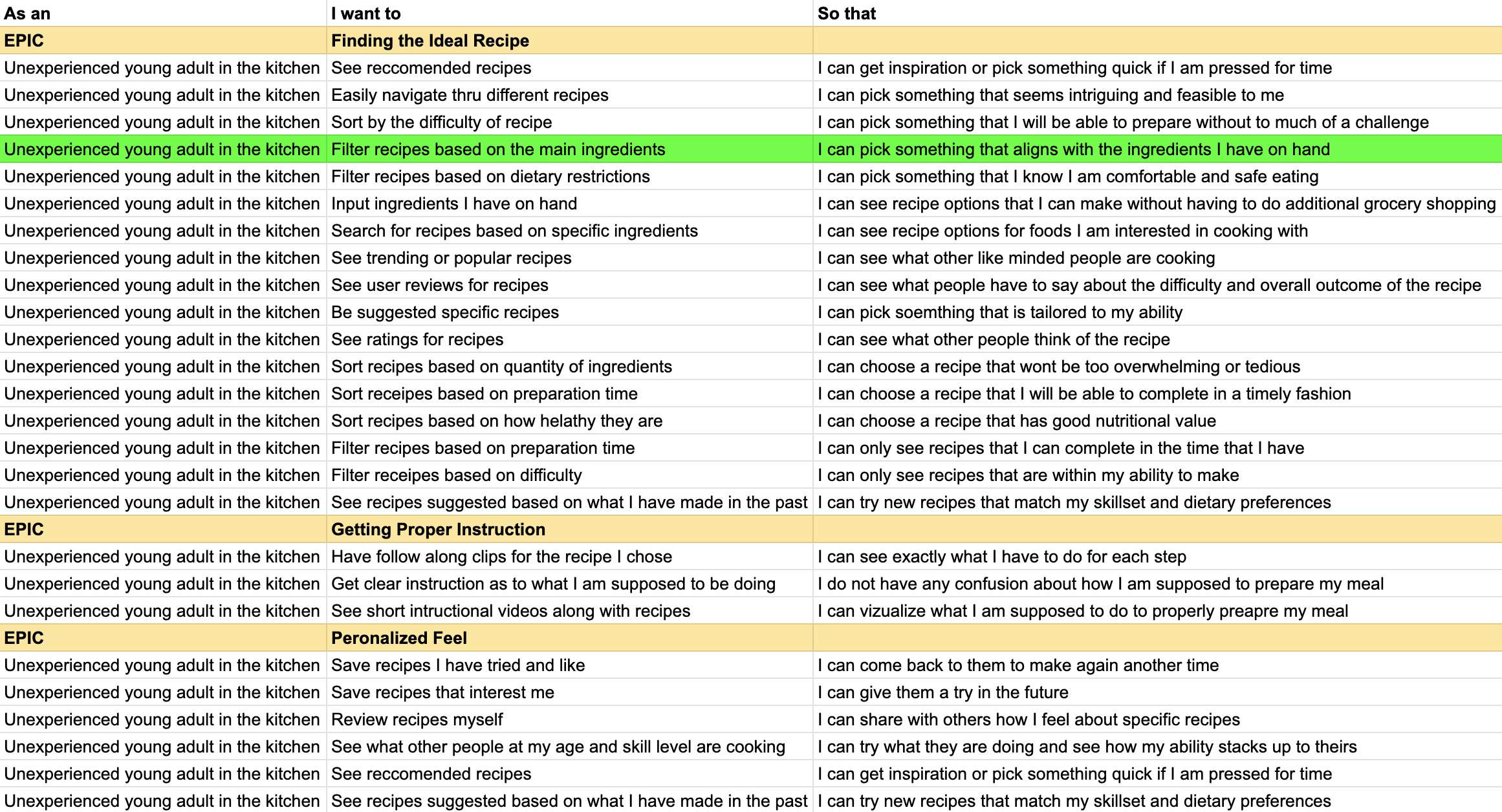
Task Selection
With the key goals and motivations of my prospective users identified, I began to generate user stories, and eventually themes, or epics, for my newly developed persona. Through these, I was able to narrow down a specific task that a user would attempt to complete in order to start cooking with my solution
I selected this epic and user story because it highlights one of the core features and uses of the app, simply deciding what one wants to cook with and then searching for recipes with specific ingredients.
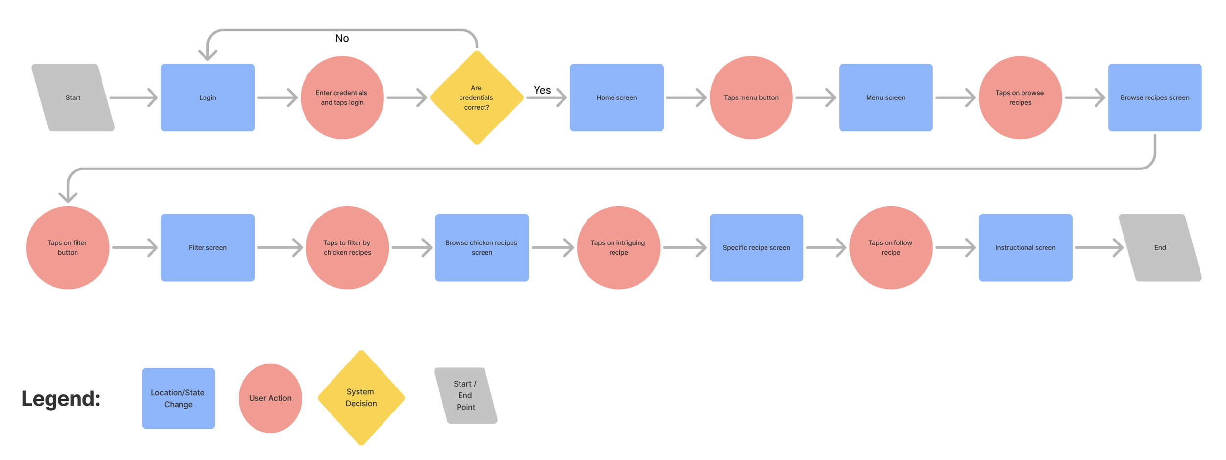
With the chosen user story, I then developed a task flow diagram to further visualize what exactly a user would do to accomplish their goal of finding a recipe for their desired ingredients.
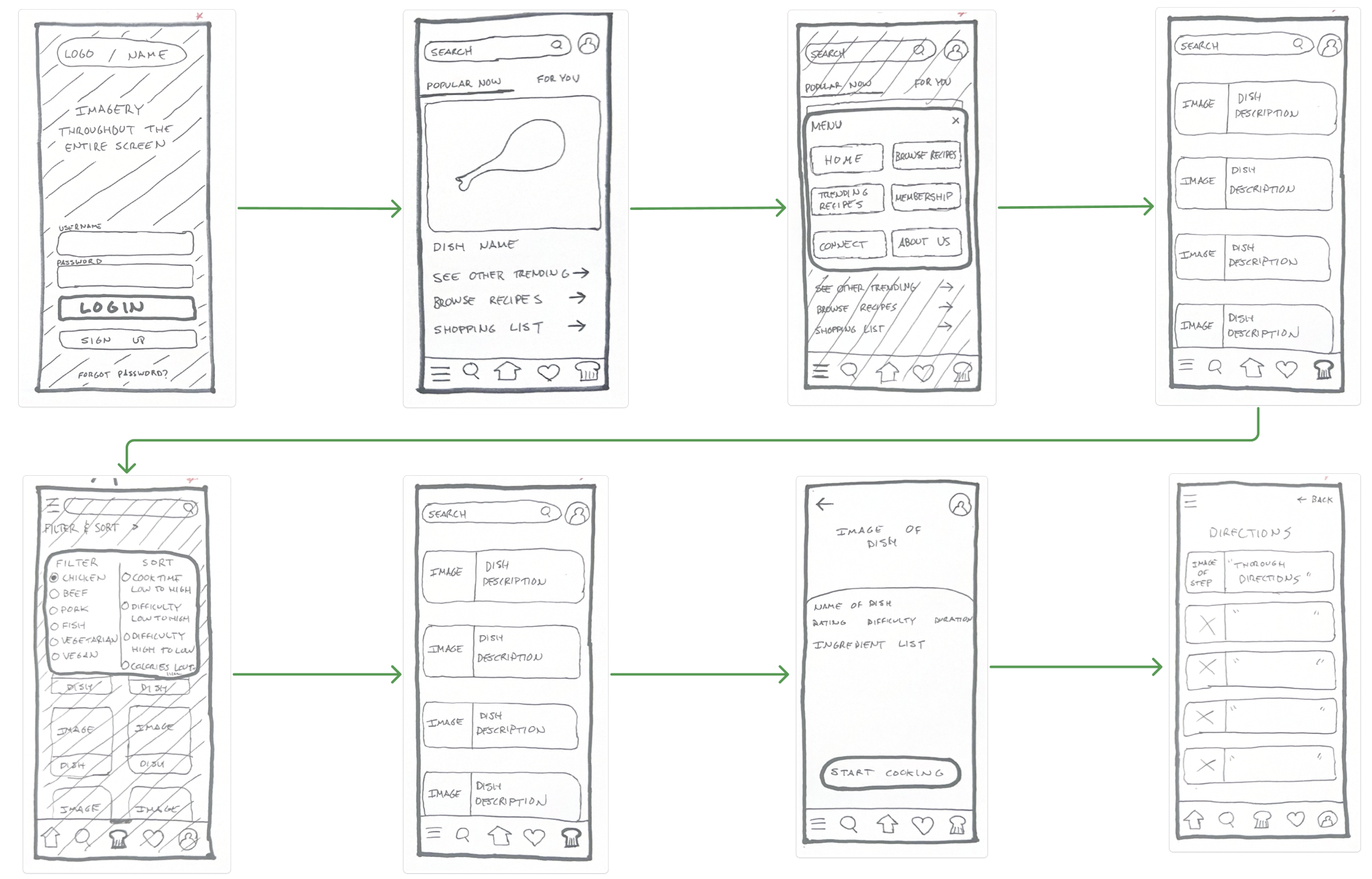
IDEATION & WIREFRAMES
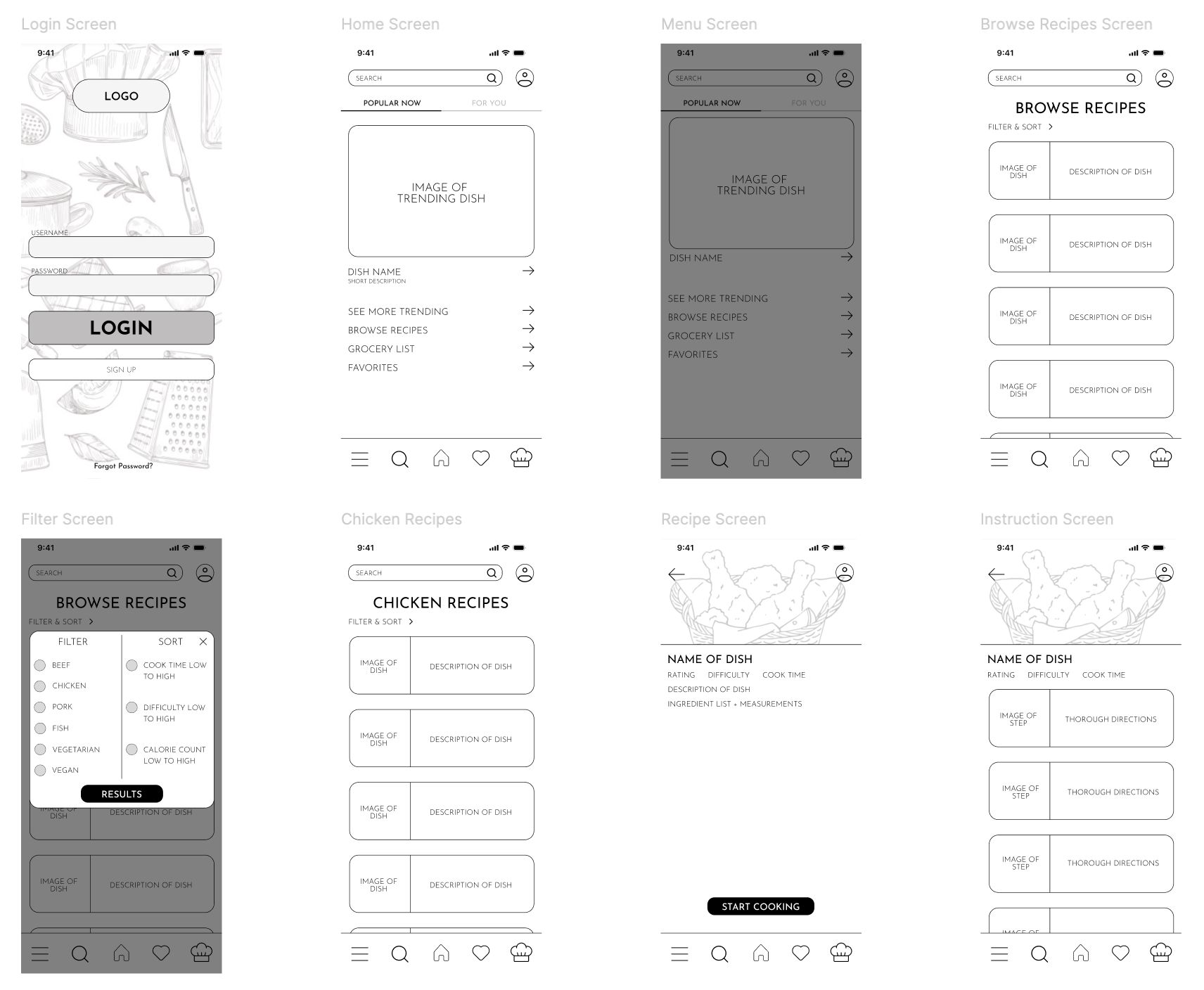
With my user tasks and persona in place, I began the design phase by sketching wireframes by hand. This quick, low-pressure method helped me explore layout ideas and map out key user flows without getting caught up in visual details. From there, I moved into Figma to refine those sketches into low-fidelity wireframes. Figma allowed me to iterate quickly, test out layout ideas, and start building a visual system that aligned with my user’s needs and goals.
BRANDING
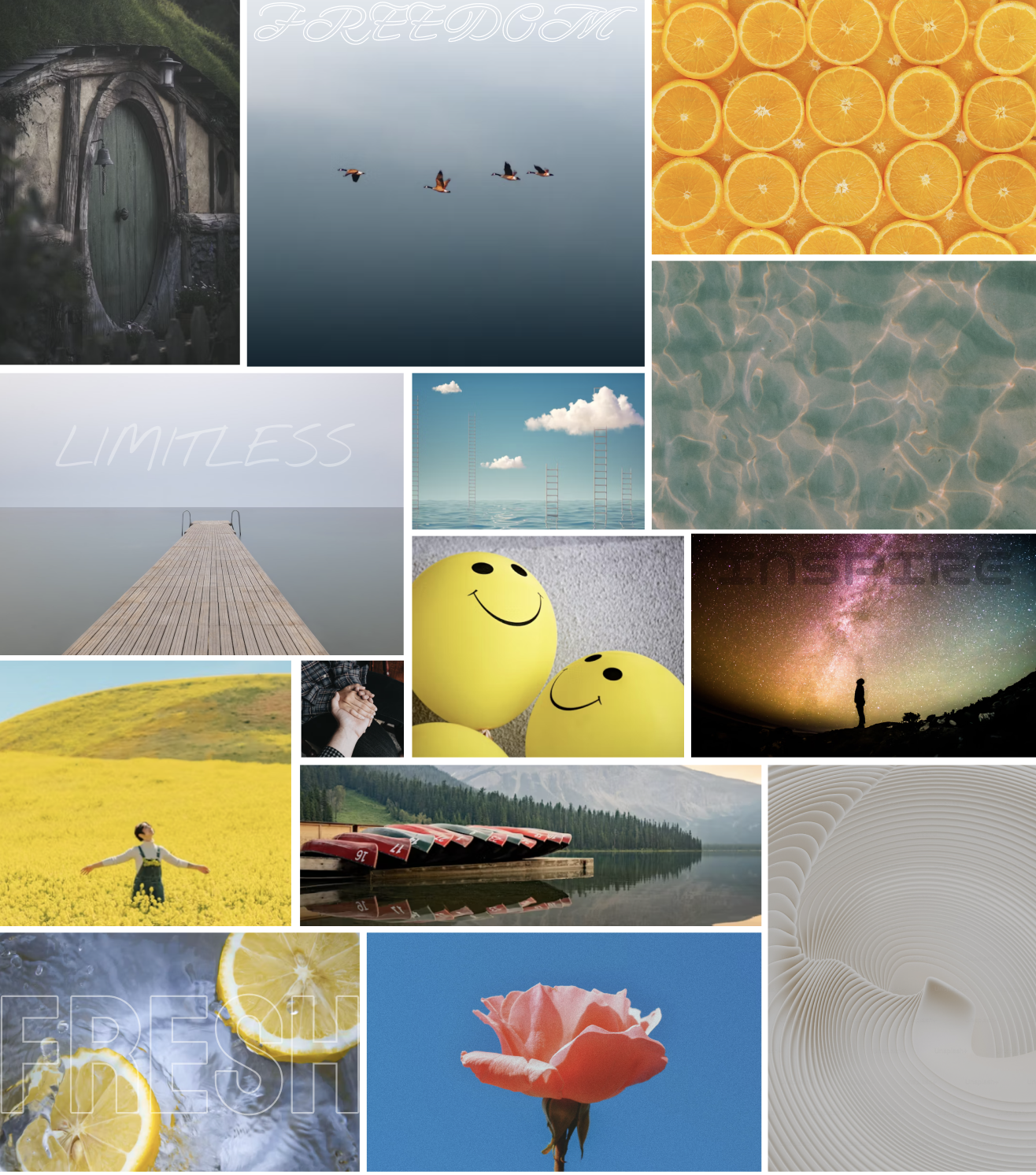
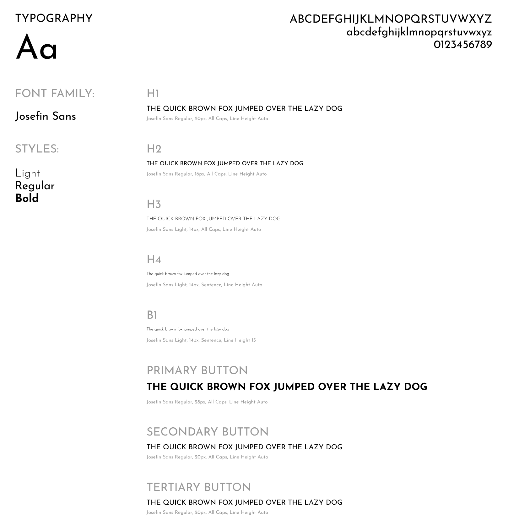
To bring personality and cohesion to my design, I moved into the branding phase. I began by creating an initial moodboard to explore a wide range of visual directions, then refined it into a curated version that reflected the tone I wanted SousChef to convey: fresh, aesthetic, intuitive, rewarding, encouraging, approachable, and interactive.
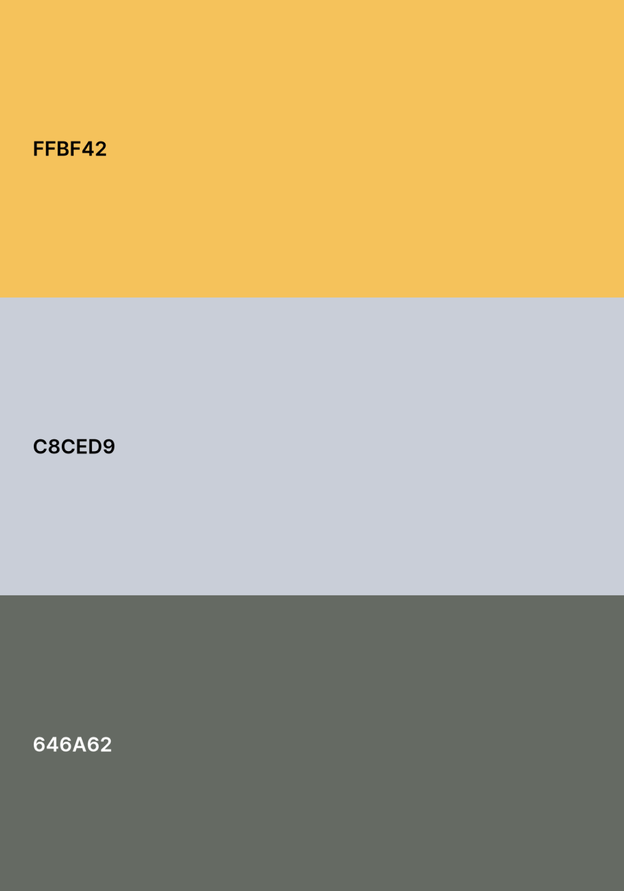
These seven distinct brand adjectives helped maintain consistency as I developed a cohesive color palette and a custom wordmark that felt both modern and friendly. This branding foundation became key in shaping a visual identity that supports SousChef’s mission: making the kitchen feel welcoming for those of all skill levels
I also chose a specific typeface to use that I felt captured and easy going and fun feel while also reminding firmly legible and professional. The typeface I chose was Josefin Sans, and I opted for a variety of fonts within it’s family.
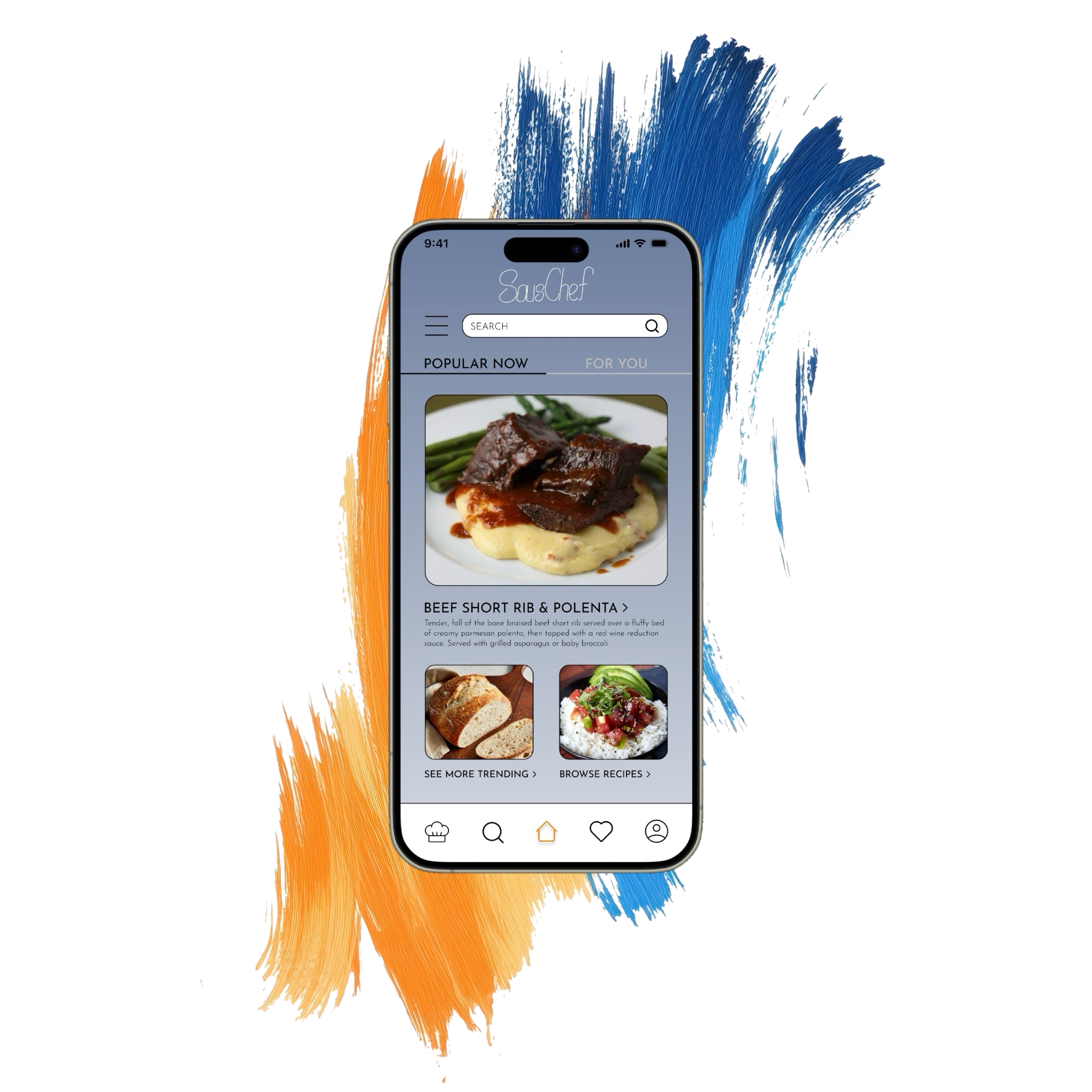
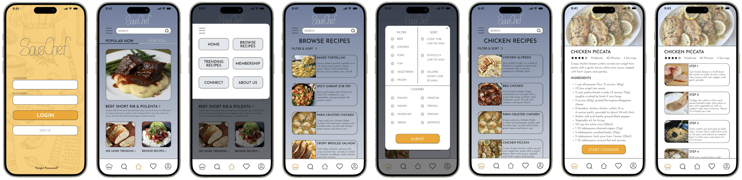
HI FIDELITY PROTOTYPE
With my branding finalized, I moved into high-fidelity design, bringing color, typography, and personality into the interface. This phase was about transforming my functional wireframes into a polished, visually cohesive experience that aligned with SousChef’s warm and encouraging tone.
I also completed multiple rounds of user testing to continue to refine and enhance my design to the specific needs and wants of my prospective users.
As I built out each screen, I focused on consistency, accessibility, and clarity to ensure the design not only looked inviting but also felt intuitive to use. This step was key in turning my concept into a fully realized prototype that users could engage with meaningfully.
DESIGN IMPACT
SousChef was designed to reduce the stress, intimidation, and lack of confidence that many young adults experience in the kitchen. Through intuitive navigation, step-by-step guidance, and customizable features, the app creates a welcoming, judgment-free space for users to learn, experiment, and grow their cooking skills. By focusing on simplicity, clarity, and encouragement, SousChef empowers users to make better food at home—regardless of their current skill level.
Although my primary user group was young adults, I found through user testing that the app’s design has a much broader appeal. The supportive tone, accessible recipes, and adaptable experience make it equally beneficial for busy professionals, parents, or even older adults looking to gain confidence in the kitchen. This universal usability reinforces SousChef’s potential to make a real difference across a wide range of demographics.
KEY PROJECT LEARNINGS
Throughout this process I learned so many things about the backend process to designing an app that I had never even considered. My 3 biggest takeaways are as follows:
1. Trust the Process – Especially When It Gets Challenging
Following the Double Diamond UX design method taught me the value of staying committed to a structured process, even when progress felt slow or unclear. During moments of ambiguity—particularly in the early discovery phase and while iterating designs—I reminded myself to trust the framework. It was during those moments that the most meaningful insights emerged. The process is designed to handle complexity, and by sticking with it, I was able to distill a broad, messy problem into a clear, human-centered solution.
2. Users Are Not Just Testers—They’re Co-Creators
One of the most eye-opening parts of this project was learning how powerful user feedback can be. Conducting user interviews, usability tests, and surveys didn’t just help me find bugs or issues—they fundamentally shaped the direction of the app. My assumptions were constantly challenged, which forced me to iterate and refine with real user needs in mind. I learned that empathy isn't a box to check—it's the foundation of every good design decision. Inviting users into the design process created a better, more inclusive product.
3. Design Is Personal—And That’s a Strength
While user data and structure guided my decisions, I also realized that the best designs carry a piece of the designer. I learned to trust my instincts when it came to visual style, interaction flow, and tone. When I gave myself permission to be creative and explore, the app started to come to life. It’s easy to get caught up in doing things “by the book,” and while, as I previously stated, it is super important to stick with the UX design process, originality and confidence often come from playing, experimenting, and making it yours. Design isn’t just logic,it’s also intuition.